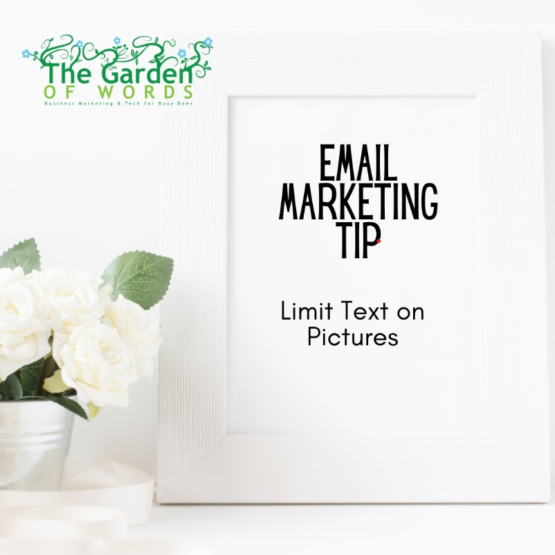
Our email marketing tip of the week is to limit the amount of text on graphics.
Using text on images is complicated for a few reasons:
1. Text in the body of your posts scales with different screen sizes, so the text is always as BIG as it can possibly be. This is especially important for people reading your emails on mobile devices, which could be up to 75% of you readers! Images scale (get smaller for mobile), but the text on images goes with the image. So it gets smaller. Text on a graphic that looks normal on a desktop can look like ant footprints when viewed on a cellphone.
2. If you put a bunch of text on a graphic, you have to, essentially, repeat that text in the image alt tags. Why? Accessibility. Because visually challenged individuals using reading assistance devices rely on that alt text. The machine won’t read the graphics. Only the alt text. It just takes more TIME to build an email this way.
3. Not all email programs load images well all of the time. What happens if someone opens your email and it looks like there’s nothing there? If you fill out the alt tags that won’t happen, but your email will still look funky, which defeats the point of trying to make it look great with images.
Our rule of thumb for most businesses is to hit the highlights in the graphic and give the details in the body copy, and ALWAYS repeat anything urgent in the graphics in the body copy.
(For example, if there’s a coupon code on the graphic, repeat it in the body copy.)
Would you like an email program review? Katie will do one for free! Send copies of your last three emails to katie@mygardenofwords.com.


