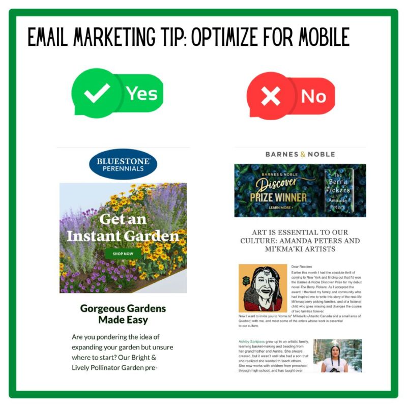
I was intrigued by the headline …
But when I opened the email, I couldn’t read it.
That’s because I was on my phone.
That’s where I read most of the emails that I go through that aren’t related to work correspondence.
Which means if they are not optimized for mobile, I’m not going to read them.
Have you checked your stats lately? I bet you have a lot more people opening your emails on mobile than you might have imagined. One of our clients has an 80/20 split for mobile versus desktop. That means if the emails are not optimized for mobile, they are not going to work.
Most email programs allow you to choose settings for mobile versus desktop. And when, in doubt, make sure that the email looks great on mobile along with desktop. It is possible to do both without having to create a bunch of separate settings.
The Bluestone Perennials email looks nice on desktop and on mobile and we do not use different settings for that
Email design and print design are really different disciplines. I’m excited to read that book that Barnes & Noble is promoting, but not because I could read the email. Only because I could read the headline.
And that could be tomorrow’s tip: pay a lot of attention to your subject line and your main header.
30 Days of Email Marketing Tips, Day 21.


