30 Days of Email Marketing Tips: Day 23

How to go mobile:
Think THUMBS!
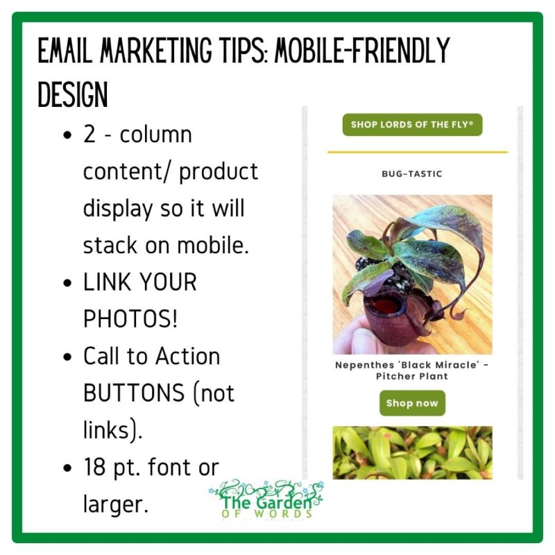
- Make every possible non text element clickable. It is much easier to tap a photo or button than linked text.
- Put side-by-side content in two columns so it will stack. (That allows it to be viewed larger.)
- Use call to action (CTA) buttons, not links.
- Fonts: 18 pt. Or larger.
- Fonts: Stay away from script fonts.
- Hide the top nav menu on mobile.
- Remember to add ALT text to images in case they don’t immediately load.
- Add frequent paragraph breaks so that people don’t get a wall of text on mobile.
- PREVIEW! Preview your email in the mobile preview or to make sure that things are legible and stack nicely and make adjustments as necessary.
What are your tips?


