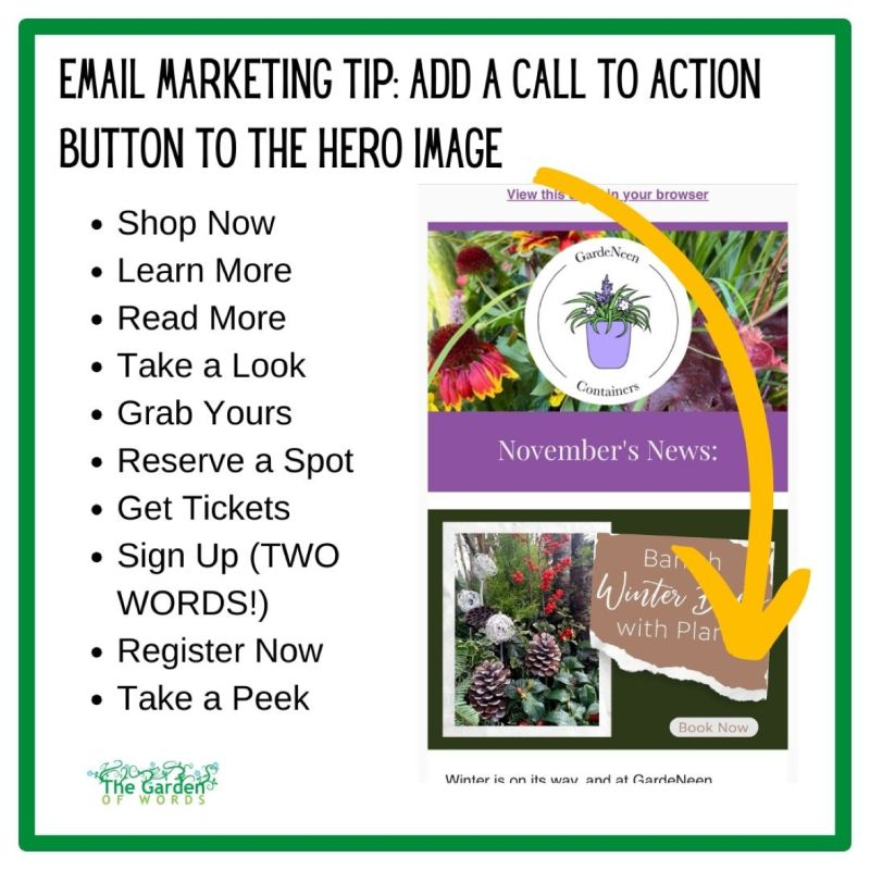
Day 16: Add a call to action button to the hero image.

- Sometimes I get pushback on this. “It doesn’t look pretty.”
And look, I get it! It’s not as pretty to have a big button right in the middle of an image. However, do you want your emails to look pretty, or do you want them to actually convert?
- We like to actually test conversion, especially if someone is reluctant to add a button. Just do an AB split test. With a button and without a button. What got more clicks? What got more sales?
- Email design is different than print design. Things in email and in digital generally are larger. They are also much more designed to guide people to take an immediate action as opposed to read and digest and act at a later time such as an hour later, going to a garden center or a week later, buying a Christmas tree. You want people to open and click through your email immediately and so the best way to do that is to make it easy for them and show them where to click.


