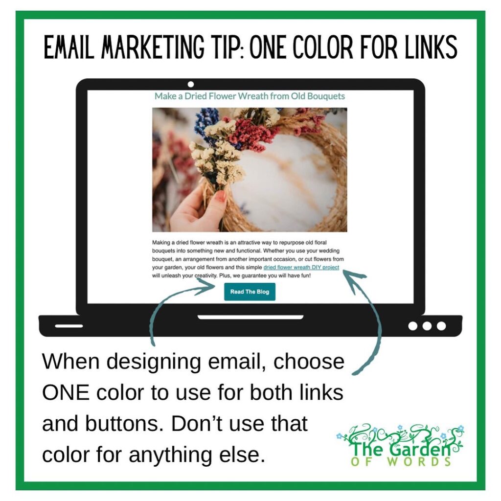
Day 5: choose one color to use for links and buttons and don’t use that color for anything else in the email.

Ideally, that color will be one of your brand colors.
Doing that will help give people a visual cue that this part of the email is meant to be clicked.
Which is why you don’t want to use that color for anything else in the email, or at least no other text, because people will think that that text is supposed to be a clickable link and will be aggravated if it is not.


