That up there is a one sheet that my team made for Ellen Zachos, a.k.a. The Backyard Forager. She wrote a fantastic book called Wildcrafted Cocktails and she is on the road to promote it. (We also made her FREE cookbooklet, so you’re gonna want to click the link and grab a copy because it is RAD.) She wants to be on the road more, so we made her a one-sheet that she can email or print and mail to prospective venues for speaking engagements.< When she emails or mails this, she tailors the language to the venue she’s targeting. (Read more about focus and message targeting here.)
Ok now that I’ve given you the option to pursue several tangents, here’s the meat about the one sheet.
It is, essentially, a FLYER.
I’ve started making these for clients of my client that sell plants to take to their trade shows. All of their plant groups on one front and back. Let’s face it: NOBODY IS READING 245 PAGE CATALOGS ANYMORE. People WILL pick up a piece of paper, and they MIGHT even take some action based on it. (If you ask them to. Ya need a CTA (call to action) somewhere. If you are a speaker that could be, “Interested? Call me! XXX-XXX-XXXX.”
If you want to cultivate people via an email list, have something that will actually help them (a checklist or planner or spreadsheet calendar or something) they can nab if they visit your website and sign up, and promote that at the bottom of their one sheet. (I have a list of super duper helpful tips that I think you can really use but I also think I am scaring y’all by trying to get you some time off. BUT IF YOU DON’T FEEL LIKE YOU EVER HAVE GOOD TIME OFF EVEN AN HOUR you can get my list here. If you follow even one tip, your one hour of time off that you allow yourself a week will be better. I promise.)
People are pressed for time. They might not even read your one sheet, but, particularly if you’re in the speaking market, this is a quick and easy way to succinctly communicate your information in a nice, colorful way. You can easily attach it to an email or print and mail it.
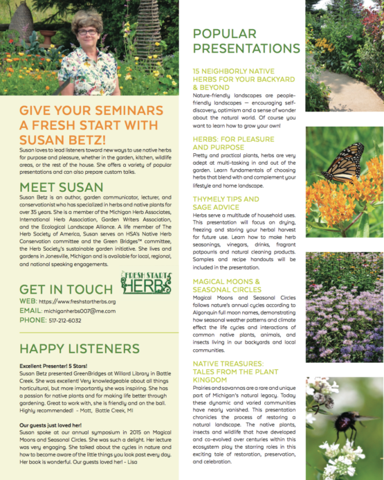
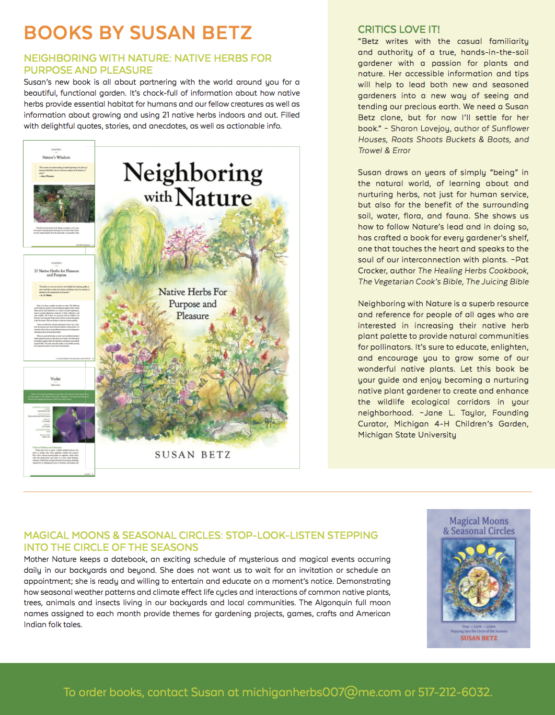
Here’s a one sheet we made for Susan Betz, author of new book Neighboring with Nature: Native Herbs for Purpose & Pleasure.
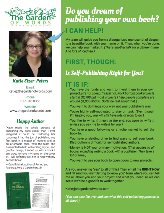
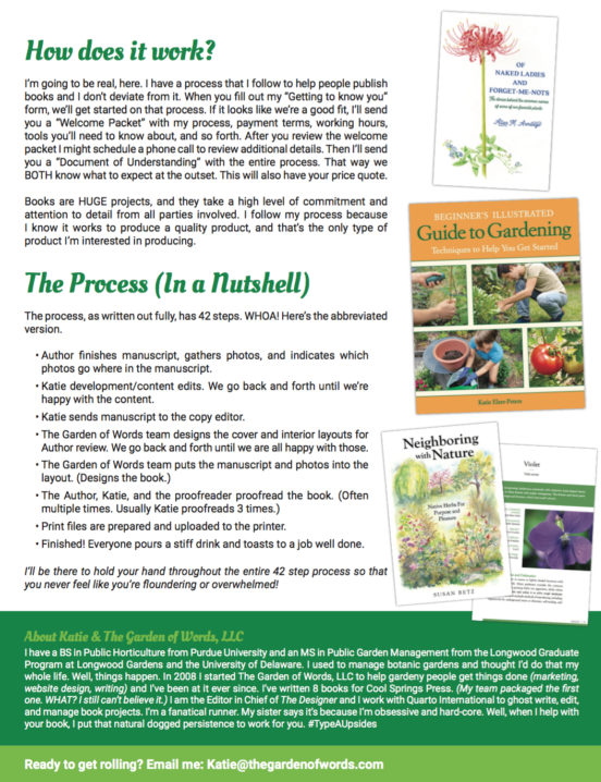
If you’re a service provider going to a conference, a one sheet is a nifty little tool, too. I made one for my self-publishing book packaging services and took it to a recent conference. Self-publishing is not an IMMEDIATE SIGN ME UP RIGHT NOW service, as most people have to think about it, but I planted the seed. SURE lots of things are digital, but if you’re with someone in person, wouldn’t it be nice to give them something beyond a business card?
TOOLS FOR MAKING ONE SHEETS
If you want to make your own, and you don’t have photoshop or inDesign (which are OVERKILL IF ALL YOU NEED IS A ONE SHEET), go to Canva. DO NOT WALK. RUN. It is a FREE service that lets you design all KINDS of things. If you’re doing a one sheet, I recommend starting with resume templates. (ShhhhhhhhHHHHHH that is what I did for my time off tips list that I won’t stop bugging you about because I’m afraid that you’re going to work yourself to death.)
The other tool is that you can hire a graphic designer. UpWork and Fiverr have plenty of choices for freelancers.
Kim, who I always talk about in my FB live videos, can also do a one sheet for you.
Last, but not least, because we’re not cheap, my team can do a one sheet for you. Check out info and packages over at the mothership. (We have a branding package, but we also do one-off one sheets. Schedule a discovery call here if that’s all you need.)
WHAT TO INCLUDE IN YOUR ONE SHEET
That depends on what you are selling, but ideally you’ll include these elements:
- A picture of you (in action if you’re a speaker). (Show you’re human. People do business with people, not with businesses.)
- Succinct descriptions of your products or services. (Talks, marketing services, accounting services—whatever services you offer.)
- A bit of the process someone goes through to hire you. This could be as simple as, “Call me” or “Email me” to get the ball rolling. I have a pretty involved process before I’ll start a self publishing project, so I outline it.
- Contact information, including your FULL NAME, website, email, and logo. (You laugh, but I’ve done a mockup before and realized I LEFT ALL OF THAT OFF.) Phone number is optional.
- Pictures of samples/products. Again, this varies based on what you’re selling. If you are selling marketing/writing services, screenshots of your work help give a visual. Put a link to a website or dropbox where they can view more. If you’re a speaker, it is effective to provide links to videos where people can watch you in action. Don’t have any? MAKE SOME.
- Testimonials! CERTAINLY you have happy customers! Use them!
- Call to action. You want people to take action after reading your one sheet. Ask them to visit your website, email you, download your free tips—something.
ONE SHEET DESIGN TIPS
- Incorporate some white space.
- Make sure it matches your branding. My publishing one sheet uses the colors of my website. It also SOUNDS like I wrote it so there isn’t a big disconnect between it and my other marketing tools.
- Do not try to cram every bit of information that people might want to know about your services. (This goes with the white space.) Stay away from 9 point font. The one sheet should HOOK the intended audience and interest them to seek more information.
SHOULD YOU INCLUDE PRICES ON A ONE SHEET?
I think that really depends on what you are selling. You could have a version with and a version without. On the self-publishing/ book packaging one I have some price ranges because that is an expensive project and I want people to understand that when they consider it. I don’t want to spend an hour on the phone with someone who really can’t swing it.
Sometimes NOT including prices, though, makes people think they CAN’T afford you, when actually they COULD. If you give lectures, you might say that prices start at $250 (or $500 or $1,000) within a 4 hour drive and increase with travel. You could say that you offer a day rate.
If you have marketing services, you might indicate that you start at $300/month or $500/month or $1000/month. You don’t HAVE to do this, but if you have some lower priced offerings, my opinion is that it helps to offer that so that people don’t automatically think that because you look so profesh (BECAUSE YOU HAVE A NICE ONE SHEET) they can’t afford you.
THE ONE SHEET ON YOUR WEBSITE
What is the equivalent of the one sheet on your website? Where can people go to get succinct information about working with you?
Jo Ellen Meyers Sharp, The Hoosier Gardener, has a GREAT page on her website with all of the information people initially need to know in order to consider booking her. If she hands out cards, post cards, or flyers and people go to her website, they can get more info about what to expect when hiring a speaker, prices, contact info, where to go to see reviews, and so forth.
I have those elements on my website here and here.
When you hand out a flyer make sure that as people follow up they have a continuous experience.
WELL, THAT GOT OUT OF HAND!
The thing with freelancing and marketing is that there is NO END to the topics I could discuss, and they are all so related that I could just write one 40,000 word blog post that encompasses everything.
OH. That would be called an EBOOK. Hmmmmmm. *wheels turning*
Now you know, anyway, what a one sheet is, what you need to put in it, some tools for making your own or hiring it out, a few design tips, and how to make it work with your website.
Happy self-promoting!
